Colour IR - How I did it...
Before I start, let me say: Color IR is hit-and-miss for me. Sometimes it produces spectacular results, and sumetimes it's just rubbish! Also, what works here wont work for every image, so experiment!
I'm just going to walk through one example here, so that you get some idea of the process.
This is the original image. It was shot with a converted Minolta S414, with a R72 filter:
I am using PaintShop Pro for this, as I have not quite figured out PhotoShop, but I assume it will be quite similar.
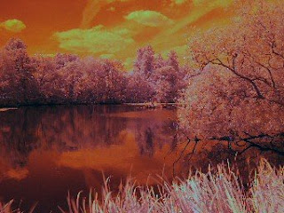
Step 1:
First Colour balance. Use the Automatic Color Balance option, with the following settings:
Strength +20
Remove Color Cast (checked)
Temperature 7500K
Step 2:
Adjust Levels (Histogram): Move the sliders on either side back to true black and true white, and set the gamma to 0.80.
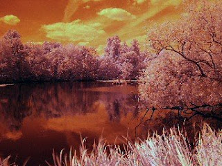
Step 3:
Saturation. Saturate accordint to your taste. I used +40 here to give a good punchy colour.
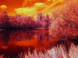
Step 4:
Colour balance, take 2. Use the Color Balance function, to incease the blues and reduce the reds, You mostly need this across the spectrum, but in this case I used +25 on blues and -25 on reds, only on highlights and midtones.
 Step 5:
Curves. Adjust the curves to increase the contrast.
Final step:
Sharpen the picture if you need to, or add other fancy effects, to taste...
Have fun! :-)
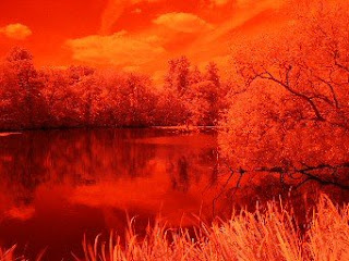
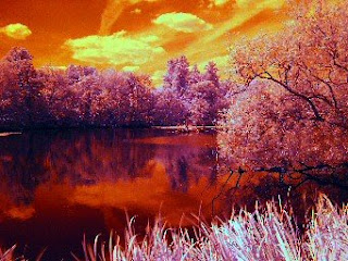
I'm just going to walk through one example here, so that you get some idea of the process.
This is the original image. It was shot with a converted Minolta S414, with a R72 filter:

I am using PaintShop Pro for this, as I have not quite figured out PhotoShop, but I assume it will be quite similar.
Step 1:
First Colour balance. Use the Automatic Color Balance option, with the following settings:
Strength +20
Remove Color Cast (checked)
Temperature 7500K

Step 2:
Adjust Levels (Histogram): Move the sliders on either side back to true black and true white, and set the gamma to 0.80.

Step 3:
Saturation. Saturate accordint to your taste. I used +40 here to give a good punchy colour.

Step 4:
Colour balance, take 2. Use the Color Balance function, to incease the blues and reduce the reds, You mostly need this across the spectrum, but in this case I used +25 on blues and -25 on reds, only on highlights and midtones.
 Step 5:
Curves. Adjust the curves to increase the contrast.

Final step:
Sharpen the picture if you need to, or add other fancy effects, to taste...
Have fun! :-)
posted by George Parapadakis at 4:42 AM
![]()

0 Comments:
Post a Comment
<< Home